
Common Mistakes in Seismic Stratigraphic Analyses (and how to avoid them)
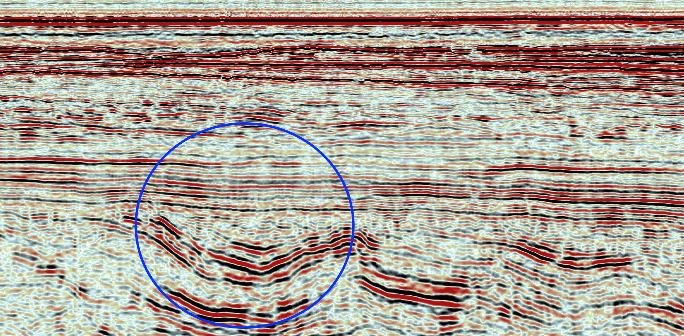
The “channel” is actually a syncline
Scale
This is where I see the most mistakes being made. One of our favorite seismic lines to use for an exercise during our Seismic Stratigraphy workshops shows an angular unconformity between folded strata underneath and relatively flat-lying strata above. The syncline circled above is interpreted as a “channel” by 90% course participants. We use this line not to trick people but to hope that one of them asks us “hey what’s the scale on this thing?” – and that almost never happens.
Recently I saw a presentation where the speaker was showing “a prograding beach” in seismic data from the 1980s to early 90s. No one in the room even flinched. Because we know its ok for beaches to prograde. The question is, how thick is a “beach?” most assume a beach = a nice sandy concave-up profile that some will equate to a shoreface. How thick is an average shoreface? 10-15 meters in most cases and about 30 meters in extreme cases. When the average seismic resolution is around 30-40 meters, how likely are you to even image a prograding beach?
Gradient
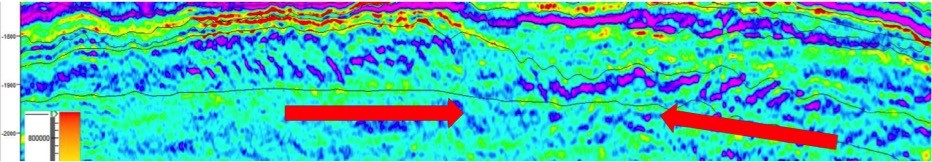
Illustrations of “Basin Floor Fans” from some of the earlier Exxon publications look nice-n-fat like a cheeseburger. Which means if that is the mental image of what deepwater lobes look like in your mind, you’re in for a surprise!
A few years ago a company I worked for drilled a very expensive dry hole. I was involved after-the-fact to investigate why things went wrong. When I asked the team why they drilled the well the answer was “it was a thick accumulation on the continental slope” – besides getting into all the reasons why that was a bad idea, the point Im trying to make here is that the accumulation these guys drilled indeed looked like a cheeseburger. Real deepwater lobes dont show super steep gradients along their margins. They are almost flat.
Deepwater lobe complex – the slight bit of topography you see is due to post-depositional tectonic deformation
Gradients in natural systems are a mystery to most interpreters and this is even a bigger problem when interpreting carbonates. I have had clients try hard to “see” clinoforms in their carbonate ramp not realizing that unless they vertically exaggerate the hell out of their data slopes less than a degree wont be picked up by the human eye.
Generalization
As nice as it is to learn from analogs and import those lessons to your area of interest, you have to bear in mind that most places wont be one-to-one analogs. An example of this would be “well, I have seen giant levees associated with deepwater channels in offshore Angola, so to find deepwater channels in the North Sea, I’ll have to find those levees first.” This sort of logic is extremely common in asset teams across the globe. Before you import an idea, why not take the time to understand the processes that created the feature in the first place?
Another example is linking depositional features to hydrocarbon production. “Well in Field X clinoforms are full of gas, and because our acreage has clinoforms in interval A we should find lots of gas too” – again, just the mere presence of a stratigraphic feature has nothing to do with its prospectivity. Why not take the time to figure out why those particular clinoforms in Field X make such attractive drilling targets?
Faults
Most interpreters have never seen faults in outcrop. To many faults represent nature’s perfect lines. I am no structural geologist but can assure you that the majority of faults in outcrop are a jumbled mess of gouge, fractures and contorted strata. This means when you image these faults in seismic they tend to produce funky features. These funky features are often interpreted as the margins of channels.
For those of you new to picking reflection terminations, if all your onlap arrows line-up vertically, perhaps this isn’t onlap at all. This is one of the most common rookie mistakes out there.
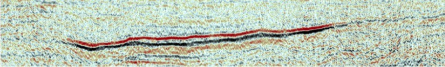
“The deepwater deltas prograding towards one another” – This actually turned out to be a Mass Transport Deposit
Context
Lack of context leads to the most spectacular mistakes out there. One of my favorites was in a dataroom in Norway years ago where the host company was presenting their “deepwater delta model” – according to their interpreter two deltas were prograding in a deepwater environment towards each other and this is what they wanted to drill. This was a new level of creativity: two deltas on the abyssal plain, sourced by rivers that are entered this basin from opposite sides.
An even more out-there model was that of a lens of marine diatomite sitting amongst Pliocene fluvial sandstones in the San Joaquin Basin of California. This is not an example from a mom-n-pop shop but one of the largest oil and gas companies in the world.
Again, instead of getting into just how ridiculous all this is I’ll focus on the right question to ask: what environment of deposition are we looking at? reefs and fluvial point-bars dont go together, so if that’s what your interpretation is, then you need to re-assess what you’re doing.
If you found this post useful you’ll probably enjoy this one as well. Thank you for reading!
Comments:
-
Abatalib
thank you for this interesting article
-
Hossam
Great Example. attributes analysis should shoe the pattern and if it a channel or something else. similar example is in west Nile delta Deepwater where similar features could be identified on seismic lines and after drilling it was confirmed to be a mud filled syncline/s.
-
Gerhard Lortzer
Thanks for sharing the best advice – Ask the right questions
Post a comment
You must be logged in to post a comment.

Hector Revilla
Most seismic explorers used to perform almost the same interpretation criteria but they mudt take into account for that seismic lines are timing lines only.